


Capital.com, the online trading platform operating across multiple jurisdictions, has introduced an updated app platform design and brand identity built around a single commitment: helping clients strive towards better decisions. The updated app is available globally across iOS and Android from May 2026.
This redesign reflects Capital.com’s ongoing commitment, shaped by research and direct client feedback: to build a platform for better decisions. That research made clear that clients wanted more context, less noise, and interfaces that support considered engagement rather than immediate action. Every design and product change is oriented around the same question: does this help clients understand their situation more clearly before they act? Where the answer is no, the element does not belong on the platform.
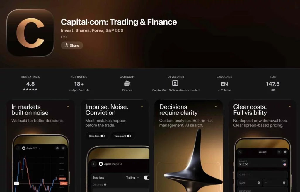
Three new features anchor the updated mobile app redesign:
- AI assistant: search markets, platform features, and FAQs without breaking focus. Relevant information surfaces at the point it is needed.
- Trading analytics: a real-time view of clients’ own trading patterns, enabling them to review performance before making their next move.
- Refined navigation: a single, personalised home screen consolidates key information — positions, market conditions, watchlists — removing the need to switch between multiple views.
Commenting on the updated platform design, Sasha Gubochkin, Chief Product Officer, Capital.com, said:
“Well-designed interfaces reduce the cognitive load on clients under pressure. The updated platform is structured to present information clearly, support deliberate engagement, and reduce unnecessary urgency. Every change was tested against one question: does this help the client understand their situation more accurately before they decide?”
The redesign also introduces a simplified visual system built around three core colours — Midnight, Light, and Gold — designed to keep focus on data rather than interface. Typography is structured for readability; layouts are organised to reduce visual load.
Adding on the visual approach, Gubochkin said:
“The visual system is intentionally restrained. The colour palette is designed to recede, not compete with the information clients are trying to interpret. The Lens — the dot in capital.com — is applied consistently as a framing device, a visual shorthand for the platform’s purpose: to bring relevant information into focus.”
In parallel, interface components have been reviewed to improve how information is organised across portfolio view, market data, and watchlists. The intention is to make relevant information easier to interpret.
Together, these changes reflect Capital.com’s broader focus on decision quality. The platform is designed as an environment where clients are provided with context, structured information, and tools intended to support deliberate decisions rather than immediate action.
To view the redesigned app, download the Capital.com app on iOS or Android.