
Stock and CFD broker Trading 212 launched a new feature on Thursday that means investors can access Sankey diagrams within the broker’s app.
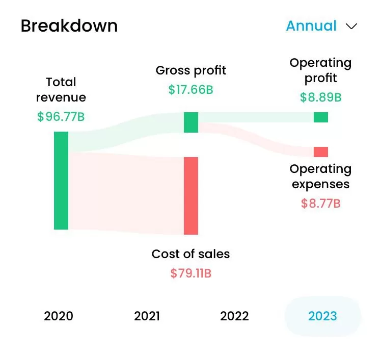
Sankey diagrams, which you can see an example of below, are a kind of flow diagram which are used to visualise cash flows and other parts of financial statements.
These became extremely popular in the last few years online. For example, one UK company called Genuine Impact started out as an app for doing financial research and analysis.
The company began posting Sankey diagrams on social media and got a huge amount of traction by doing so.
In fact, they were so successful that the company appears to have pivoted from being a research app, to something more akin to a news service, sending readers two emails a week with different charts in them.
Given Trading 212’s own pivot to becoming more of an investment-focused app, it wouldn’t be surprising at all if they were aware of this trend and consequently decided to integrate the feature into their app.